
Open HubSpot as a sales rep and you see a pipeline-focused workspace. Log in as a marketing manager and campaign performance becomes the priority. Sign in as an admin and billing, permissions, and account management take center stage. The same platform, data, and login create three distinct experiences depending on the user’s role. That is role-based design, and it has become one of the clearest indicators of a mature B2B SaaS product in 2026.
The appeal of building a single dashboard for everyone is understandable. It is easier to design, simpler to maintain, and faster to launch. However, it is increasingly becoming a drawback. Modern enterprise software serves admins, managers, and front-line users within the same account. A generic interface forces each user to sift through information that has little relevance to their day-to-day responsibilities.
What makes this trend important is not its novelty. Role-based access and permissions have existed for years. The shift is that users now expect the experience itself, not just access rights, to adapt to their role. Buyers evaluating software increasingly notice whether a product delivers a tailored experience for different user groups, making role-based design a key differentiator in the B2B SaaS market.
Quick Takeaway
Role-based design means the interface adapts to what a user actually does, not just what their permissions allow them to see. A sales rep, a marketing manager, and an admin logging into the same product should see meaningfully different default views, each surfacing only the handful of metrics relevant to their job. The payoff shows up fastest in enterprise sales, where buyers evaluating software now decide whether it’s credible within the first thirty seconds of a demo.
What Role-Based Design Actually Means
Role-based design is built on two related but distinct concepts. Permission-based design controls what a user can see or do, such as hiding billing settings from non-admin users. This is a standard feature that has existed in enterprise software for years.
Role-based design goes beyond access control. It actively prioritizes the features, workflows, and metrics that are most relevant to a user’s role, rather than simply hiding functions they cannot access. This distinction is important because permission-based design alone can still leave users navigating the same cluttered interface. Role-based design creates a more focused experience by showing each user what matters most to their job.
Done well, role-based design feels less like a settings toggle and more like three genuinely different products sharing one underlying platform, each one obviously built for the person using it.
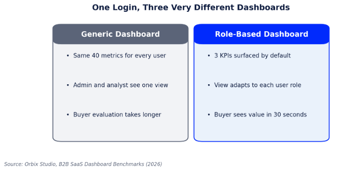
Figure 1: How a generic dashboard compares to a role-based one.
Why One Dashboard for Everyone Stopped Working
Enterprise SaaS products have grown far more capable in the last few years, and capability has a side effect: more menus, more settings, and more data points competing for the same screen. A platform that started with twenty features and one dashboard now often has two hundred features and, in many cases, still one dashboard. The result is what design teams call purpose-built fatigue, with every user wading through functionality built for someone else’s job just to reach their own.
Enterprise buyers feel this acutely during the evaluation process. A platform that needs ten minutes of dashboard explanation before a prospect understands what they’re looking at has already lost ground to a competitor whose interface explains itself based on who’s logged in.
This shows up in renewal conversations too, not just initial sales. Internal champions who have to keep explaining an unintuitive dashboard to new hires on their own team accumulate quiet frustration with a tool, even when the underlying functionality is solid, and that frustration is exactly the kind of thing that surfaces at renewal time when a competing product promises an easier onboarding experience.
How Leading B2B Products Apply Role-Based Design
The pattern shows up consistently across the SaaS products design teams point to as benchmarks. A sales rep’s home screen prioritizes deals and next actions. An admin’s home screen prioritizes seats, billing, and system health. The underlying data model doesn’t change, only the lens applied to it does, which is precisely what makes the pattern sustainable rather than a maintenance burden disguised as personalization.
A Practical Framework for Mapping Roles to Views
Building genuinely role-based views starts with mapping jobs to outcomes before a single screen gets designed. This is the sequence we use with product teams.
| Step | Question to Answer | Design Output |
| 1. Job mapping | What is this role actually trying to accomplish in the product? | A short list of outcomes per role, not feature requests |
| 2. Metric triage | Of everything available, what 3 metrics actually matter on login? | A default view limited to those 3, expandable on demand |
| 3. Friction audit | Where does this role currently dig through irrelevant menus? | Navigation reordered around their most frequent tasks |
| 4. Validation | Does a new user in this role reach value within one session? | Usability testing per role, not one generic test pass |
Mistakes That Undermine Role-Based Design
Role-based design fails most often when teams treat it as a cosmetic feature rather than a structural decision. Common pitfalls include:
The underlying issue is usually organizational rather than technical. Role-based design requires sustained collaboration between product, design, and customer-facing teams to keep views accurate as jobs evolve, and it’s easy for that collaboration to quietly lapse once the initial project ships.
- Designing roles around org chart titles instead of actual day-to-day tasks, which rarely map cleanly to job function
- Building role-based views once and never revisiting them as the product and its users’ jobs evolve
- Letting each team request their own custom view, producing inconsistent navigation that no one can support
- Hiding so much that power users can’t find advanced functionality they genuinely need
- Skipping role-specific usability testing and validating the design only with whichever role was easiest to recruit
Work With THP’s Design & UX Studio
THP’s Design & UX Studio runs the job-mapping research and interface design behind role-based B2B products, turning a single sprawling dashboard into a focused experience for every role that touches it. If your platform still shows every user the same screen, that’s where we’d start.
Author