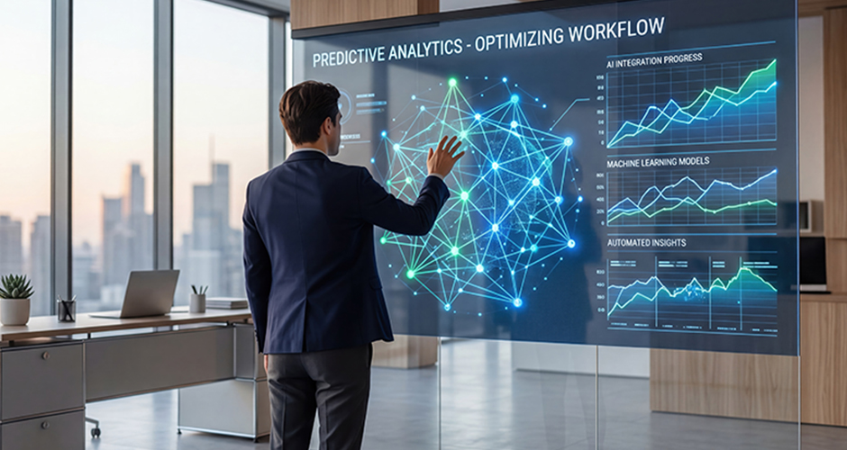
Most B2B SaaS dashboards still work the way they did a decade ago: log in, see the same fixed grid of widgets everyone else sees, and hunt through menus for the one thing you actually need today. Predictive interfaces are the first real challenge to that default in years. Instead of waiting for a user to click through a sprawling menu, a predictive interface uses behavioral and contextual signals to surface the next likely action before the user has to look for it.
This matters more in B2B than it might seem, because enterprise buyers now form a first impression of complex software in the span of a single demo. A product that still makes a procurement manager hunt for relevant data in front of a room of evaluators is quietly losing deals to a competitor whose interface gets out of the way faster.
It’s also worth separating the hype from the practical reality. Plenty of vendors now market “AI-powered” interfaces that amount to a single recommendation widget bolted onto an otherwise unchanged product. A genuinely predictive interface reshapes what the user sees by default, not just what gets suggested in a sidebar. The difference shows up immediately in how a first-time user experiences the product.
Quick Takeaway
Predictive interfaces use role, intent, and behavioral signals to reshape what a B2B SaaS user sees in real time, rather than presenting the same static dashboard to every login. Buyers now decide whether they trust a product within the first 30 seconds of a demo, and progressive, predictive interfaces are becoming the difference between a tool that proves its value instantly and one that requires a guided walkthrough to make sense.
What Predictive Interfaces Actually Are
A predictive interface adapts in real time based on who’s using it, what they’re trying to do, and what they’ve done before, rather than presenting a fixed layout decided once at design time. Role-based adaptation shows a CEO a high-level visualization, while an analyst logging into the same product sees granular, actionable details. Intent mapping uses behavioral patterns to surface the next most likely tool before a user looks for it. The combined effect is a workflow that feels condensed, even though the underlying product hasn’t gotten any simpler.
This is a meaningfully different idea from basic personalization, which usually just means a user can rearrange widgets or save a custom view. Prediction means the system makes an informed guess about what you need next and acts on it, surfacing it, not just allowing you to configure it manually in advance.
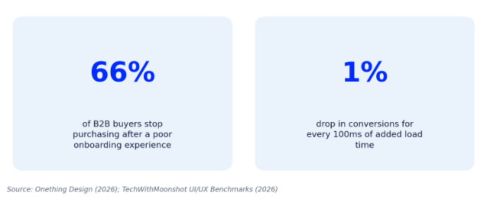
Figure 1: What a confusing first session costs B2B SaaS products.
Why Static Dashboards Are Losing Enterprise Deals
The cost of a confusing first session in B2B SaaS is no longer hypothetical. Research from Onething Design found that 66% of B2B customers stop making new purchases after a poor onboarding experience, and the problem compounds: every 100 milliseconds of added load time or friction has been shown to reduce conversions by roughly 1%. None of that is about whether the underlying product works. It’s about whether a first-time user, often evaluating three competitors in the same week, can find proof of value before attention runs out.
Enterprise buyers rarely give a product a second chance to make a first impression. A dashboard that requires a guided tour to make sense is implicitly asking a busy evaluator to do extra work on the product’s behalf, at the exact moment they have the least patience for it.
How Predictive Interfaces Work in Practice
Predictive UX is built from a handful of repeatable techniques rather than one single feature. Role-based defaults change what’s visible based on a user’s permissions and job function. Progressive disclosure hides advanced settings until a user has demonstrated readiness for them, instead of presenting every option on day one. Smart empty states use a new user’s first available data to suggest a specific next action rather than displaying a blank screen. None of these require exotic machine learning. Most start with simple, well-instrumented rules based on role and behavior, and grow more sophisticated as usage data accumulates.
Command palettes are a related, increasingly standard pattern worth mentioning here. Rather than predicting what a user wants automatically, a command palette lets an experienced user type their intent directly and skip navigation entirely. It’s a complementary approach to prediction that works especially well for power users who already know exactly what they want to do next.
A Framework for Introducing Prediction Without Losing Trust
Prediction only helps if users trust it. Move too fast and the interface feels unpredictable; move too slowly and you’ve built nothing more than a slightly nicer static dashboard. The table below is the sequencing we use with product teams.
| Phase | What to Predict | Risk If Skipped |
| 1. Role defaults | Which view loads first, based on job function | Every user sees irrelevant data on login |
| 2. Progressive disclosure | Which advanced features appear, based on demonstrated usage | New users are overwhelmed before activation |
| 3. Next-best-action | Which task to surface next, based on behavioral patterns | Users miss high-value features they never discover |
| 4. Adaptive layout | How the workspace reorganizes itself over time | Power users feel like the system is guessing wrong |
Common Mistakes When Teams Rush Predictive UX
Predictive interfaces fail in fairly predictable ways. Watch for these before committing real engineering time:
Most of these failures come from a single root cause: treating prediction as a feature to ship rather than a behavior to earn, which usually means launching before there’s enough real usage data to make the predictions trustworthy in the first place.
- Predicting before there’s enough usage data, which produces visibly wrong guesses that erode trust fast
- Hiding controls so aggressively that experienced users can’t find functionality they actually need
- Treating prediction as a replacement for clear navigation, instead of a layer on top of it
- Designing for the demo instead of the daily user, so the product looks great in a sales call and frustrates in week three
- Skipping a manual override, so users have no way to correct a prediction that’s consistently wrong
THP’s Take: Prediction Should Earn Trust Before It Takes Initiative
THP Studio Perspective
We tell product teams to think of predictive UX as a junior colleague who’s still earning the right to act without asking. Start by surfacing a suggestion and letting the user confirm it; only automate the action outright once the system has a track record of being right. Buyers don’t reward cleverness for its own sake. They reward an interface that makes them look competent in front of their own stakeholders, fast.
That last point matters more than it might seem in a B2B sales context. An enterprise buyer evaluating your product in front of colleagues isn’t just judging the software. They’re judging whether recommending it will make them look good internally. An interface that anticipates their needs correctly does some of that reputational work for them.
Frequently Asked Questions
Key Takeaways
- Predictive interfaces adapt to a user’s role and behavior in real time, rather than presenting the same static dashboard to everyone.
- 66% of B2B buyers stop purchasing after a poor onboarding experience, making first-session clarity a revenue issue, not just a design preference.
- Predictive UX is built from repeatable techniques: role-based defaults, progressive disclosure, and next-best-action prompts, not one exotic feature.
- Introduce prediction in stages: role defaults first, adaptive layout last, always with a manual override available.
- The goal is earning trust before taking initiative: suggest before automating until the system has a track record of being right.
Work With THP’s Design & UX Studio
THP’s Design & UX Studio designs and prototypes predictive, role-based product experiences for B2B SaaS teams, from UX research and information architecture through to a design system your engineers can actually build from. If your demo still needs a guided tour, that’s the conversation to start.
Author